Thinking process behind our product's first major redesign
Throughout 2022, Argonaut has made continuous updates to your experience on argonaut.dev and ship.argonaut.dev, with a goal of creating a new, fresh user experience that is light visually while giving the user full context of what is happening.
It all started in June with a bunch of brainstorming sessions with our designers, marketers, and front-end engineers. Where we identified several points of friction in the old user experience and a design that was inconsistent for the user and not in tune with what wanted to deliver for a seamless Argonaut experience.
Following that, the project was broken down into 4 phases - the landing page, the new intro video, the live app pages, and the static app pages. The project was then set in motion going through prototype, user research, design, development, and testing faces over the next six months. This huge refresh helped us put more attention to every stage of the user’s journey, from their first visit until their first deployment.
Landing page
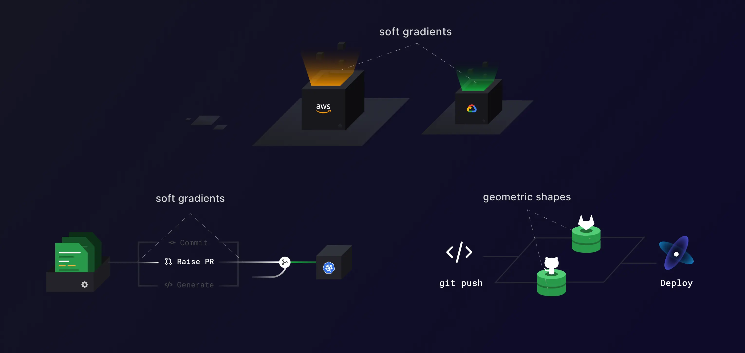
A landing page is like a living entity that breathes your brand inside and out. Having a simple and effective landing page in a single-page format that covers all the value that Argonaut provides was a high on our priority. We started by choosing our theme of geometric shapes and soft gradients to show how we operate. We use this across our page to show our value prop right from the start.
The Dream heading also has an animated gradient behind it signifying a forward motion and also the transparency and trust that Argonaut can bring to your DevOps process. We added a few more visuals throughout to show how we make things easier for our end users. Recognize a few familiar logos?
We further break down each section based on your workflow with Argonaut, making it more relatable to how we solve your DevOps struggles. And we also stay away from industry Jargon and stick to the core values that we bring to our users.
Blog
We are moving away from dark gradients and the same green, and blue hues to more vibrant and softer gradients of all colors. This in addition to getting rid of the blog title on the cover and representing it visually is the direction we choose going forward. Further, making the last part of the blog screen compact by getting rid of some additional details and with shorter descriptions is also part of our move towards making things more compact and minimal. This helps us fit in more content while preserving white space and without making it cluttered.
Intro video
Argonaut’s new intro video - Your Dream DevOps Platform was right in time with the announcement of our GCP support and our Product Hunt launch at the end of August. The video reflects many of the same design elements like the use of gradients, minimal geometric designs signifying various components, and a simple flow mirroring a potential user’s flow with Argonaut.
The storyline of the video talks about the various problems developers face while deploying their apps to the cloud. Issues like juggling between multiple DevOps tools, and increasing complexity with scaling team and workload. Argonaut solves these issues in place without context switching while providing customizability and cost visibility.
Product pages
The biggest chunk of our changes lies here. These were also the most difficult to implement as we had several hours of user research followed by back-and-forth work sessions with the devs to get every last detail right.
The focus of all the changes to our product was two key pillars:
- Always keep the user in the context
- Reduce distractions without compromising customizability
This can be seen right from our onboarding experience.
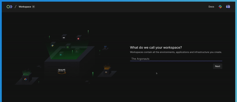
Onboarding experience
Our new onboarding experience is more structured than before. Hiding distracting buttons and components from the user who just landed at our doorstep. It helps new find their way into our product and understand the essence of every button and component without being loud about it.
The overall onboarding has thus become considerably faster, and even folks without prior DevOps experience have been able to use and set up on Argonaut without much difficulty.
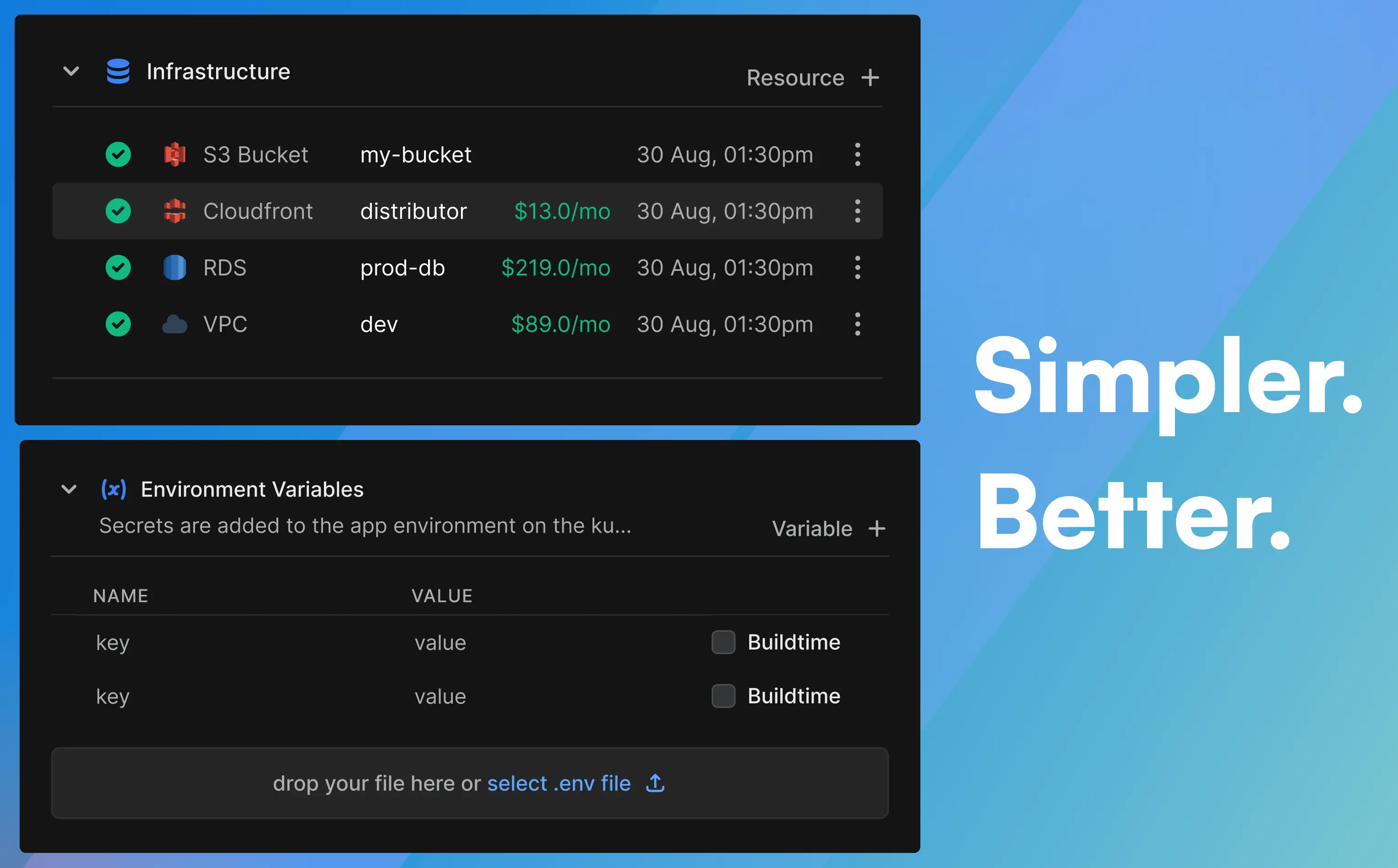
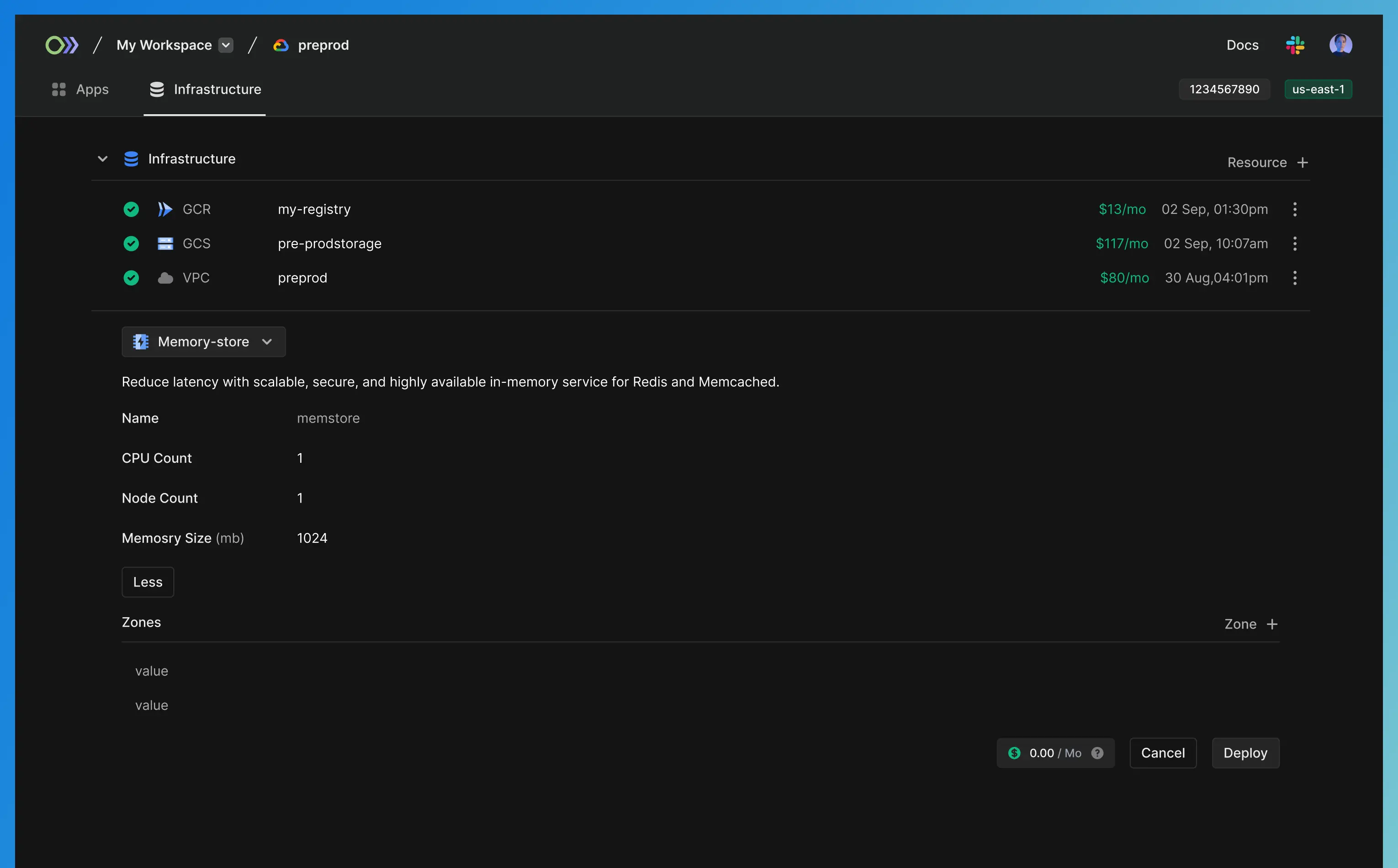
The new empty states of the environment, workspace, infra, and apps pages make it clear to the user what the immediate next step is for them to achieve their desired action.
Consistent UI experience
We have worked hard to make our users’ experience more consistent across pages. This starts with the move away from a card-based design with bounding boxes. Sections consistent of related features/configuration/entities that are clubbed together and are collapsable. They can be identified by their title and divider, and icon in some cases.
For example, all our CTAs are now present on the right side of each section. This consistency helps the user continue using Argonaut just like they did in their first onboarding, making their workflows faster on each use. We have also reduced redirections wherever possible. All new resource/ integration/ entity creation is done inline and expands as a dropdown, so you stay in context while performing your most crucial tasks.
Wherever you are in Argonaut, you always have access to your current location as breadcrumbs. Clicking on the Argonaut logo takes you back to the Infrastructure page, and your current Org, and environment are also visible right from there. Therefore, navigating has never been easier.
Compact components
We have removed unnecessary bounding boxes from UI components, such as text fields. This makes it easier on the eye while also making more room on the screen for showing important things like your existing deployments and apps.
We have also pushed many options into the menus, like the (X button) that is shown only on hover. Additional changes like changing the color, size, and background of text and UI components in several places have made it easier to spot the right button to click or action to take. Linear app was one of our main inspirations for such a design.